Epitomizing our Emphasis on Creativity.
회사의 기업 아이덴티티(Corporate Identity)는 회사의 얼굴이자 상징입니다. 회사가 지향하는 가치를 표현하고 공유하기 위한 적극적인 마케팅이자 커뮤니케이션 활동으로 조직의 본질을 나타내는 고유성, 다른 조직과 구별되는 차별성, 일관된 연속성 등을 그 특징으로 합니다. 디자인피버 역시 디자인피버만의 고유한 철학과 생각을 바탕으로 아이덴티티를 꾸준히 관리, 개선하며 시대와 트렌드의 변화에 적절히 대응해 왔습니다. 그리고 그 중심엔 언제나 ‘크리에이티비티가 있었습니다.
Corporate identity is the overall image of designfever in the minds of diverse publics. It is the marketing and communication activities that identify the characteristics distinguishable from other organizations; actively expressing a company’s philosophy and goals. designfever’s identity has steadily evolved in response to changes in our culture and society based on our philosophy and focus on creativity.
2005 Drops for designfever
디자인피버의 첫 얼굴은 ‘알약’입니다. 디자인피버라는 회사 이름을 반영하여 열병을 치료할 수도, 열병에 걸리게 할 수도 있는 알약을 모티브로 삼았습니다. 하지만 병을 낫게 하는 일반적인 약보단 크리에이티브한 즐거움을 주는 알약의 의미를 강조하고 싶었기 때문에 캡슐이 아닌 드롭(Drops)의 형태로 알약을 표현하였습니다. 생기발랄한 느낌을 전해주는, 딥 옐로우(Deep Yellow)를 심벌의 색으로 선택한 것도 같은 이유에서였습니다.
회사의 이해도를 높이기 위해 로고는 기본 스타일의 산세리프체 2가지를 혼합한 로고타입과 심벌의 조합형으로 제작되었습니다. 디지털 디자인 분야에서의 혁신적인 디자인, 다양한 크리에이티브를 시도할 줄 아는 회사의 이미지를 로고에 담았습니다.
The first new designfever logo was a pill. The motif stemmed from the idea of a medication that references our name, designfever. Rather than using a symbol that represents a drug that can be taken to cure the ‘fever’, we chose to utilize a ‘drop’ that enhances this ‘fever’ for creativity rather than suppress it. For the same reason, a deep yellow which expresses lively feeling was used to represent the symbol.
The logo was produced by combining the symbol and logotype, comprised of two san serif typefaces, to enhance the understanding of our company. The image of the company is represented by our logo, a creative combination of digital and innovative design.
2008 Creative X Experience
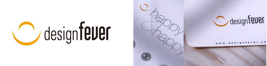
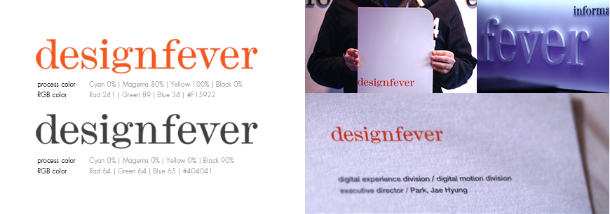
그동안 디자인피버는 창조적 소수(Creative Minority)를 슬로건으로 삼아 달려왔습니다. 하지만 2008년, 57명의 임직원들과 함께 하는 디자인피버는 더 이상 소수도 아니고 작은 부티크도 아닌, 국내 크리에이티브계를 이끄는 디지털 에이전시로 자리매김하게 되었습니다. 자연스럽게 좀 더 신뢰감 있는 이미지를 반영한 새로운 아이덴티티가 필요하게 되었습니다.
새로운 디자인피버의 얼굴은 심벌과 로고타입을 함께 사용하는 조합형 방식을 벗어나 독립적인 로고타입 형태로 제작되었습니다. 안정된 느낌을 주면서 세련미를 주는 모노타입 모던체(Monotype Modern)를 적용하였고, ‘design’과 ‘fever’ 두 단어를 하나의 라인으로 이어 유니크한 느낌을 더하였습니다. 디자인피버의 새로운 로고타입은 기존의 딥 옐로우보다 더 붉은, 강렬한 오렌지색으로 다시 태어났습니다. 한층 붉어진 오렌지는 기존의 색보다 더 열정적인 디자인피버의 모습을 전달합니다.
이와 함께 ‘크리에이티브(creative)’와 ‘익스피리언스(eXperience)’라는 키워드를 중심으로 한층 창조적인 회사의 철학과 비전을 반영할 수 있는 슬로건을 함께 제작하였습니다. 이러한 목표 아래 만들어진 슬로건, ‘All beyond the digital creative, All for the new experience’는 창의적인 열정과 경험이 풍부한 기업의 이미지를 전달합니다.
As time progressed designfever coined the slogan 'Creative Minority'. In 2008 with 57 employees, designfever was no longer a boutique design firm, but rather one of Korea's leading creative digital agencies. With a more confident image, designfever needed to update our creative identity.
The new logo of designfever was created using a different approach, a logotype independent of a symbol. To give a unique impression of sophistication, Monotype Modern typeface was applied to combine the words ‘design’ and ‘fever’. The new logotype transformed from the traditional use of a deep yellow color into an intense red-orange that is striking in appearance, symbolizing an increase in enthusiasm for design.
In addition, the slogan included the keywords ‘creative’ and ‘experience’ to further reflect the vision and philosophy of the company. The slogan ‘All beyond the digital creative, all for the new experience’ was used to deliver a rich corporate image while stating our goals for creative passion.
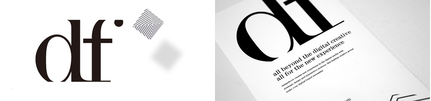
2013 A variation of the designfever logo
시대를 앞서가는 크리에이티비티로 열정과 영감을 불러 일으키는국내 최고의 크리에이티브 에이전시, 디자인피버.
새로움을 끊임없이 지향하며 최선의 방향, 새로운 크리에이티브를 선도하는 디자인피버만의 감성을 더욱 새롭게 전달하기 위해 2013년 디자인피버 공식 웹사이트 리뉴얼을 단행하였습니다. 론칭 시점에 맞춰 모던하면서도 정갈한 느낌의 로고타입 베리에이션을 별도로 제작, 디자인피버 아이덴티티의 새로운 톤앤매너를 시도하였습니다. 만들어진 로고 베리에이션, ‘df’는 디자인피버 사명을 은유함과 동시에 디자인의 기본이 되는 메타포에 대한 디자인피버의 고민을 드러냅니다.
Our passion for inspiration and creativity helped develop designfever into one of Korea’s top creative agencies. We renewed our website once again in 2013 to better exemplify our position as a leader of modernity and creative direction. Part of this rejuvenation included the creation of a new logo, emphasizing designfever’s unique identity in a clean and modern form. The new variation of the designfever logo is marked by the simplistic ‘df’, implying the name of company while serving as a metaphor for our belief in focusing on the basic elements of design.