Creating a high-impact and professional
online presence for designfever.
회사의 공식 웹사이트는 클라이언트와 고객을 비롯한 모든 방문자에게 회사의 인상을 심어주고 그들과의 소통의 문을 열어 주는 온라인 채널로서, 일관된 아이덴티티를 전달하고 전문성을 부각시키면서 동시에 시대의 변화를 반영한 회사의 방향을 보여주는 역할을 합니다. 디자인피버의 공식 웹사이트는 창립연도인 2000년부터 지금까지, 트렌드의 변화와 회사의 확장 경향에 발맞춰 콘텐츠 재구성, 기능 강화, 리디자인 등 꾸준한 진화를 거듭해 왔습니다. 국내 최고의 크리에이티브 에이전시로서 새로움을 향한 시도를 멈추지 않는 정신과 철학이 그 안에 녹아 자리하고 있습니다.
The company's official website is an online channel that opens the path for communication with clients and visitors while simultaneously expressing the company’s expertise and value through consistent identity, embracing a future-focused direction. Since its founding in 2000, designfever’s official website has gone through numerous reconstructions, content enhancements, and steady design evolutions in order to reflect the current trends as our company continues to grow. As a leading creative agency in South Korea it is our philosophy to continue to be at the forefront of ingenuity, and our website will continue to serve as an example of this idea.
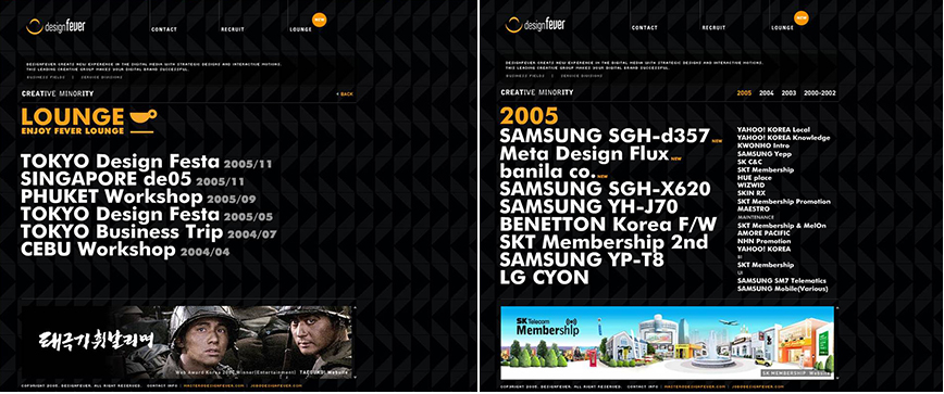
2005
Effective information architecture
‘창조적 소수(Creative Minority)’를 슬로건으로 삼아 디자인 부티크를 지향하는 디자인피버의 발전 방향을 반영해 2006년 공식 웹사이트를 개편하였습니다. 디자인피버의 이전 웹사이트들에서 찾아볼 수 있는 간결한 디자인적 접근의 맥락을 이어 불필요한 그래픽 요소를 최소화하였고 특히 폰트의 굵기와 색 등 최소한의 차이만으로 정보의 위계를 깔끔하게 표현한 것이 특징입니다. 보는 이의 눈을 즐겁게 할 만한 세련된 비주얼은 플래시를 적극 활용해 만든 화려하고 부드러운 모션과 만나 새로운 임팩트를 만들어 냅니다.
In 2005 designfever’s website was revamped using the slogan ‘Creative Minority’ to reflect the direction and development of designfever as a boutique design agency. Following the theme of simplicity that was found in prior websites, unnecessary graphic elements were excluded to create information architecture using simply typefaces and colors. The site utilized flash to create a level of visual sophistication that could entertain the eye, allowing for smooth motions to achieve a strong visual impact.
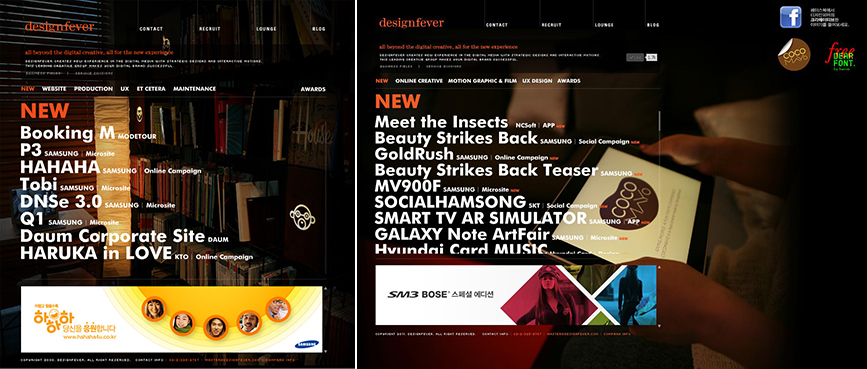
2008
Showcasing the new identity of designfever
2008년, 대한민국 리딩 디지털 에이전시로서의 위치를 공고히 하고 앞으로의 방향성을 보여주기 위해 만들어진 디자인피버의 새로운 아이덴티티를 웹사이트에 반영하였습니다. 한층 붉어진 기업 컬러, 오렌지를 전면에 내세워 디자인피버만의 유쾌한 매력을 사이트에 더하였고, 메인에 노출되는 포트폴리오를 연도별 대신 아웃풋 성격을 기준으로 구분하여 방문자가 한결 더 편하게 디자인피버의 포트폴리오를 감상할 수 있도록 하였습니다. 더불어 백그라운드 이미지를 주기적으로 변경하여 사이트의 공간감을 살리고 보는 이에게 늘 신선한 느낌을 주고자 하였습니다.
In 2008 designfever revamped their website to reflect a new corporate identity, showing the future direction of our company and its position as a leading digital agency in South Korea. Using the orange color scheme that is synonymous with designfever, the website was designed to deliver the company’s high quality projects to a public audience. The portfolio was categorized according to the types of outputs produced rather than years of production to allow for easier viewing. By changing the background image, users can always have a unique impression and actively engage when they visit the website.
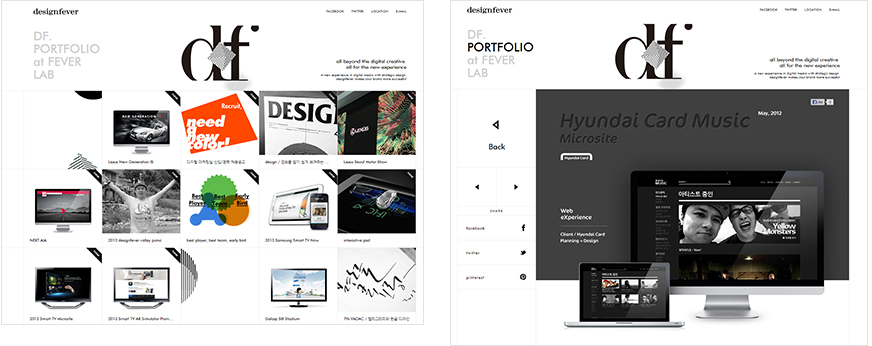
2013
Back to the basics
13년간의 꾸준한 사업 영역 확장과 프로젝트 규모 확대 경향에 맞춰 국내 최고 크리에이티브 에이전시로서의 존재감을 다시금 확립하기 위해 2013년, 공식 웹사이트 개편에 들어갔습니다. 디자인피버 자체를 드러낼 수 있는 표현의 창구, 그 본연의 역할에 충실, 디자인피버의 기업 이미지를 온라인에서 명확하면서도 구체적으로 드러내고, 한 걸음 발전된 새로운 가치를 표현하고자 하였습니다. 디자인피버의 철학과 가치, 좋은 퀄리티의 아웃풋, 특별한 기업문화 등 디자인피버를 보여줄 수 있는 모든 콘텐츠를 가장 ‘온전하게’ 전달하는 것, 그것이 프로젝트의 우선적인 콘셉트였습니다.
비주얼에 있어서는 디자인이란 사물을 있는 그대로 그려내는 것이 아닌, 사물을 형상화하고 은유화하는 일이라는 철학 아래, 그 기본이 되는 ‘형상화’, 즉 ‘조형’에 주목하였습니다. 이에 조형의 기초이자 근본이 되는 점과 선, 형을 비주얼적 모티브로 정립, 기하학적이면서 모던한 룩앤필을 이끌어내었고, 표현된 도형 전체 혹은 일부에 움직임을 넣어 동적인 느낌을 강조하였습니다.
In order to represent the expansion of our business and project scales during our 13 years, we again decided to undergo a website reconstruction that would continue to mark our presence as Korea’s best creative agency. We focused on created a corporate channel that could accurately describe designfever’s past but also introduce our vision for the future. The project’s priority was to accurately display our philosophy in all aspects of the company; not only showing examples of our high-quality level of output, but also the value of other things such as our corporate culture.
Our philosophy on design focuses on the idea of ‘shaping’ and ‘molding’ something, rather than just simply depicting it. As such, these key words were important in the restructuring of our website. Using dots, lines and various geometric shapes along with subtle animation, the site creates a dynamic atmosphere for users to enjoy.